Tuesday, December 22, 2009

Someone's learning Illustrator...

I try, I really do. Here's a logo (the lettering part already existed) incorporating a new mascot I designed.
Here's a logotype for Diamond Ruby who is the main character in my friend's soon-to-be-published novel. Picture her initials on the front of a baseball cap in 1923. Stay tuned as this may be featured on other materials, like a poster and actual caps.

Tuesday, November 24, 2009

More Star Wars by fans


I got interviewed for this ABC Online article about the Star Wars Uncut project, which is a good opportunity to link to it again, and to point you to a clip by my friends' son Gio, a gradeschooler whose clip is awesome and whose drawings (above) of Stormtroopers, C3P0, and Leia put mine to shame.

Tuesday, November 10, 2009

She Wore Blue Velvet

I have written before about how much this movie affected me when I first saw it. I should probably mention that I haven't seen it in over twenty years and don't necessarily want to view it again. The snippet they used in "The Squid and the Whale" was enough for me. But "Blue Velvet" has stayed with me. It's a good entry point anyway to look at poster design in different places.
Here is a Turkish version. Helpless damsel and macho violence.

This German version focuses on montage and heavy symbolism.


These two evocative French posters show characters looking out, helplessly. The one on the left decorated the front window of a video store near my college, so I would be greeted by that haunted look whenever I walked to class.

I saw a copy of this hanging in an office at the JBFC, signed by Isabella Rossellini herself. What does this disturbing and violent image have to do with the disturbing and violent film? The story is that it is based on a scene excised from the final cut of the film.


This is a Polish poster by Jan Mlodozeniec, who created many film posters and applied his light and clever touch to even the darkest subjects.


This is a DIY poster for a 2008 Valentine's Day college campus screening. Looks like it's 5 in a run of 25 screen prints. I bet they all were taken soon after being posted. I know I would have wanted one.

Tuesday, October 13, 2009

Like, whoa!

What if, like, you could be inside the sphere that M.C. Escher is holding, and be, like, peering out, and looking all around the room? Dude, now you can.

Friday, September 25, 2009

Final Star Wars scene


Star Wars Uncut - Scene 021 from Gregory Nemec on Vimeo.


My last one (only three are allowed, which is probably a good thing for my sanity) which includes my first attempt at hand-painted frames. The rapidly changing lighting is so much a part of the shot of the pod launching that I didn't see another way to do it. I already had a healthy respect for Alexander Petrov, but my respect for him has grown.

Monday, September 21, 2009

Starring Obi-Wan, C3P0, Han and Chewie


Star Wars Uncut - Scene 351 from Gregory Nemec on Vimeo.

I am bitten by the Sweding bug. I chose this scene because it wasn't really a scene, it's bits of three different threads of the story. Who wants to act that out? But animating it is no problem. Also, a chance to draw four of my favorite characters (see title of this post) AND Stormtroopers? Please.

Wednesday, September 16, 2009

The Death of Biggs

Star Wars Uncut - Scene 453 from Gregory Nemec on Vimeo.

Here is my contribution to the GREATEST IDEA EVER on the internet. The idea in a nutshell: chop up the first Star Wars* into fifteen second clips and let people shoot their own versions of those clips. Compile them all in one place and you have a remake of a beloved movie, in hundreds of different styles. Some are pretty much just like the "Sweded" scenes in "Be Kind Rewind", with various degrees of professionalism. Many use Lego and action figures, and at least one artist used hand-painted paper bag puppets. I did mine in cut paper stop-motion, with a few self-imposed limitations: no sketching with pencil first, no do-overs. If I had been too picky, I never would have finished all fourteen shots. Fourteen shots for fifteen seconds of film! I noticed a lot of animators gravitated to the action scenes, with lots of quick cuts.

I love all the creative solutions people came up with to re-create moments from the film. A narrow hallway for the garbage compactor scene. A computer keyboard as the surface of the Death Star. And, wow, a milk carton on its side DOES look just like a Jawa sandcrawler.

*okay, I have a beef with them using the "new and improved" version, not the original version. But whoever did scene 196 decided not to have Greedo shoot first. See, it's the GREATEST IDEA EVER on the internet.

Thursday, August 27, 2009

It's not copying, it's an homage.


(click on my artwork to see it much bigger)

Autobiographical numbers describe themselves. For example, the subject of this art is 1210, and it has 1 zero, 2 ones, 1 two, and 0 threes. 1—2—1—0. Get it? It's the smallest autobiographical number. Fun for a geek like me, and fun to be able to add my name to the long list of people who have ripped off the famous Rockwell triple self-portrait. Of course he was the master of doing that:

Friday, August 7, 2009

Dime Bag show ending soon!

I had a great time at the opening of Dime Bag 3, featuring my little rabbit painting and lots of great art by lots of artists. Stop by Giant Robot and see all the work by Wednesday. Then it's coming down. Trust me, it's worth seeing. Tiny work that packs a big wallop. You can buy the individual pieces of art, ranging in price from $10 to $500, online if you can't make it to the show. Check out Giant Robot for details. There are lots of photos of the super-crowded opening courtesy of Giant Robot on Flickr, but here are the highlights from a Greg-centric point of view.


Illustrator and co-curator Jordin Isip. The look of a man who just hung up almost 300 works of art.


The red dot means someone bought my painting. I hope it gets a good home.


This was one of two walls full of art. I hear that additional work went up after the opening. Click images to see in more detail.


This is what happens when you invite several hundred artists to be in a show, and they each bring a friend or two...


So since my wife was sad that my painting might be sold, and she liked it, I created a companion piece for her. She likes it even better. Maybe because we have two bunnies of our own now.

Wednesday, June 24, 2009

Teeny tiny art


Done for an upcoming group show called "Dime Bag 3" at Giant Robot New York. Each piece of art has to fit inside a three-inch plastic baggie. Tiny paintings, drawings, sculptures, all displayed on the wall in their zip-lock bags.

This is the first piece I have done that I would consider multimedia scratchboard. Scratching, sandpaper, scratching, oil paint, more scratching, in a genuine wood frame. Scratchboard's not usually soft and warm so that was my motivation. Click on the photo to enlarge.

Thursday, June 4, 2009

Portraits in Two Directions and Cartoons!


I just finished up a semester of teaching gradeschool and middle school artists, and whenever a kid had some downtime (either finishing a project early, or wishing they weren't doing the current project) I would ask them if they would draw or paint me, I could draw or paint them, and we could trade art. So here's a variety of simultaneous portraits.
Each grid has a corresponding portrait in the other, so the center portrait of me was painted by the artist who is shown in the center of the kids. (She also drew the bottom center portrait of me, as she is quite prolific. The bottom center portrait in the grid of kids shows what happens when I screw up—turn it into a pirate!)

The artist who opens our exhibit above did not want her portrait created, but watched and recorded the moment that Justin and I drew each other. Click on these to see them in much more detail.

One of my animation students and I made this movie by moving sand around on a light table. He was great at figuring out how to turn one shape into another.


Also, here is an animated film created by two first time animators with me this semester. It's a feminist masterpiece that's a little over two minutes long.


Friday, May 8, 2009

Back to, oh yeah, illustration


Lots of illustrator interviews on this site, but I am the freshesh one as of this moment. Get it now, hot out of the oven, before the fat lady sings.

Saturday, April 25, 2009

Celebrating Celebrity Resemblances

The latest Facebook activity I have enjoyed is "I've been told I look like..." 

You select five celebrities from their database and post them. When friends balked at some of my choices (and they aren't really my choices, it's what others have said) I tried to recreate them, starring me. (click image to enlarge)

Of course, it's not my idea to try and look as much as possible like a photo of someone I allegedly resemble. It comes from a smarter and funnier guy. Check out this classic Kids in the Hall minute.


If fictional characters had been an option, I could have included Harry Potter, Where's Waldo (way too strong of a jawline), and the groom from "The Corpse Bride" (just right in the jawline department). And way back when, several people noticed my resemblance to (these are obscure) the kid at summer camp afraid of swimming in the 1885 TV movie "Poison Ivy" (Cary Guffey, several years after he was a kid in Close Encounters) and the young piano genius in "Shine" (Noah Taylor, who went on to play a young Hitler).

Then there's the game of picking who would play you in the biopic of your life. I am actually leaning toward Noah Taylor, but my sentimental favorite is Steve Buscemi.

Monday, April 6, 2009

Mary Worth, by Alan Moore


With just a little noodling, mysterious fiance Ted Confey becomes:

Thursday, April 2, 2009

Bring on the Silly!

In honor of the impending reunion of these two guys on The Tonight Show, here's my nominee for the funniest thing ever seen on their show.

Thursday, March 12, 2009

What's Greg been making?


I've been busy with lots of illustration projects, as well as teaching. Here are a few things recently released into the wild. Two just for fun, and one not, but which was a lot of fun to make anyway. Above is a panel from Apartment 3G, a comic strip that has been around forever and is a favorite over at the Comics Curmudgeon, thanks mainly to the character Margo, whose coldness and self-absorption border on villainy. Someone suggested that this panel, which sums up Margo's philosophy perfectly, would make a good shirt or a Roy Lichtenstein painting. Josh was kind enough to post my "appropriated" version. Actually, I barely changed it, just cleaned it up and added the all-important Lichtenstein flesh tone dots.


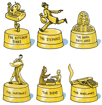
Item two: here are the latest "awards" I have drawn over the past year or so, given out by the hosts of Filmspotting for their movie marathons. They represent marathons with these themes: Angry young men (British working class dramas from the 1960's), heist movies, 1970's sci-fi (we know Planet of the Apes was 1968, but the spirit is right), Almodovar, Bergman, and film noir. Have I mentioned I love this podcast?
  
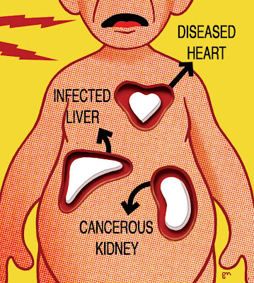
Last but not least, here's a piece I did for Trial Magazine about organ donors not being properly screened for disease. This happens extremely rarely, but when it does it's tragic, as donors' organs tend to go to numerous recipients. Sometimes a topic is so gruesome that I feel the need to go in the complete opposite direction with the art. And again with the Lichtenstein dots!

Thursday, March 5, 2009

Screaming Links

Today's topic: screaming faces in art. What expression captures modern man's unhappiness as well as a scream? Everyone knows Edvard Munch's "The Scream," but he was not alone, or the first.

Above is a self portrait by Franz Messerschmidt. Not a scream as much as a grimace, this is one of sixty-four extreme, even grotesque "Character Heads" which he sculpted, believing that the act of creating them and using them as guides would help fight the evil spirits/mental illness plaguing him, and hopefully help others with similar afflictions. Hard to believe these were done in the 1770's; they are so modern in their sensibility. 

Here's a collection of some of my favorite screaming faces from the past century.


TOP LEFT: On my first visit to John Fisher's house to learn to play Dungeons and Dragons, he showed me the cover of King Crimson's "In the Court of the Crimson King." John was a friend of my older brother, and the album belonged to his older brother. There was an overall older brother vibe happening as we listened to the first song, "Twenty-First Century Schizoid Man."
TOP RIGHT: A friend recently sent me a link to an animated student film that was inspired by the King Crimson album from almost forty years earlier. Six thousand paintings, according to the film's creator. I'm not sure how he is defining individual paintings as they seem to be digital, but a Herculean feat nonetheless. 
CENTER LEFT: Gottfried Helnwein's take on contemporary angst. If the King Crimson album had come out twenty years later, this could have been the cover. This is the first image I ever saw of his art, and he has been making indescribable things for most of my lifetime, touching on everything from Austria's whitewashed Nazi past to surreal visions of Donald Duck.
CENTER RIGHT: Still from Sergei Eisenstein's silent 1925 film "Battleship Potemkin." This is one of the final frames of the amazing Odessa steps scene, depicting Tzarist troops slaughtering innocent civilians.
BOTTOM LEFT: Francis Bacon's "Study After Velazquez's Portrait of Pope Innocent X." I grew up seeing this painting in the Des Moines Art Center, which was free and which I could ride to on my bike. I was fascinated by it as a kid, that something so terrifying could also be beautiful and in a museum. Maybe that is why it is still my favorite Francis Bacon painting. Was it inspired by Eisenstein's film as well as by Velazquez? I don't know.
BOTTOM RIGHT: A frame from "Raiders of the Lost Ark," which made me think of the Bacon painting when I first saw it, but now everyone says is an homage to Eisenstein. It may also just be a coincidence—did Spielberg know what it would look like, when he filmed a time-lapse shot of a multilayered wax head collapsing under heat lamps? What isn't a coincidence is that it is showing the fate of the most sadistic Nazi in the movie.

Thursday, February 12, 2009

Another List?


There is a huge backlash against the Facebook "25 Random Things About Me" exercise, which to me seems like getting mad at people for keeping a diary, or writing a blog, or being on Facebook to begin with. So flying in the face of opposition, here's another self-indulgent list.

I was inspired by my favorite podcast Filmspotting when they recently discussed transcendent filmgoing experiences, where what happens in the theater goes beyond just seeing a movie. (A listener had written in with a story of the stars of "Once" doing a Q and A at a screening and unexpectedly performing the film's signature song. One of the podcast's hosts mentioned feeling hugely energized by watching "The Matrix" and, curiously, "Meet The Parents." Say what? That's why I love that podcast.) 

This was right up my alley, and as Filmspotting is known for their top five lists, here's mine. They are in reverse chronological order, which also happens to be in order of increasing significance, which seems logical. The most recent isn't on the list, but "Pan's Labyrinth" just blew me away, thrilled me, and left me emotionally drained.

Greg's Top Five Transcendent Movie-Going Experiences


5. 2004: The Last Waltz. It's always good when a long-anticipated film surpasses expectations, and this did. Pristine print, and the best sound I have ever experienced in a theater. Still probably the best time I have ever had at the movies.


4. 2002: Chicago. This was a special preview screening and Q and A with director Rob Marshall and critic Janet Maslin. While it was an entirely enjoyable film, the real thrill was seeing Maslin helping Marshall navigate through his dawning realization that this would be not just a hit, but a grand slam. He had clearly never seen it with a full audience before. Two hours earlier he was probably just hoping people liked it, after the screening he seemed transformed.


3. 1986: Blue Velvet. A Philadelphia college student, on a rare afternoon free, goes alone to see the latest movie by the guy who made "Eraserhead" and "The Elephant Man" and has his mind exploded. Luckily the staff of the dumpy little theater off Rittenhouse Square didn't come and clean between screenings, so he could sit through it again.


2. 1984: This Is Spinal Tap. The night of high school graduation, three friends went in knowing it was supposed to be funny, but not knowing we were in for the funniest two hours of our lives. Bonus: The angry metalhead who stormed out of the theater when it dawned on him, a half hour in, that he was watching a parody of all that he held dear.


1. 1977: Star Wars. Like "The Last Waltz," a long-anticipated (three weeks is LONG when you are eleven and EVERYONE is raving about this thing) film that exceeded expectations. I am sure I am not the only one who watched the opening sequence with the massive Imperial Star Destroyer looming over my head and realized, "movies can do ANYTHING."

Oddly enough, I only own one of these movies ("Star Wars," obviously) and don't have a great desire to watch any of the others over and over. The intense experiences were enough.

Friday, January 23, 2009

Nudity You Can't See

An art director and friend of mine was clearing out her and her husband's huge collection of books and ephemera and came across something that I thought only existed in jokes: The Braille edition of Playboy. No centerfold, I am assuming.

On the other end of the spectrum, artist Jason Salavon has gone into centerfold overload. He created art by blending the images of every Playboy centerfold, mathematically averaging the color and value of each, one per decade. This is every Playmate from the 1980's:

So Miss November 1981, who presumably does not appear in the Braille edition above, is hidden amongst the pixels here. To see the art based on other decades, click here. I really like how they are completely luminous and ethereal, like a soul should look.

Salavon has done similar amalgamations (his term) of class photographs, special moments, and architecture, video amalgamations of late night talk shows, and an audio amalgamation of twenty-seven versions of the song "Yesterday." He also has interesting art based on still frames from movies

I obviously can't get enough of this kind of thing. Once I created visual formulas to depict some of my friends (you know, "You are like two parts Yukon Cornelius and one part D-Day and a dash of My Name is Earl") and one of them created a similar formula for me. It included Duchamp, John Linnell from They Might Be Giants, and the animated groom from The Corpse Bride, among a half dozen others. I blended them all together, Salavon-style, to create a metaphysical portrait of me:
Salavon creates his own software to make his art; I just fiddled with Photoshop layers. Here are my friends Scott, Wayne, and Fran, done the same way. Hidden in there are Saddam Hussein, Orson Welles, George Harrison, Dylan Thomas, Terry Gilliam, Casper the Ghost, and many others.

Friday, January 16, 2009

Why designers can include movie tickets as business expenses


My friend Scott, who is responsible for pointing me in the direction of much that is awesome, sent me this link to an ever-expanding website that collects screen captures of movie titles, from A:


to Z:


(Zathura, by the way, is by no means the last one on the list, what with Zombies being on Broadway and Zontar being from Venus and so on. Similarly, Anatomy of a Murder is preceded by lots of Alien and Abbott and Costello movies. I just like the looks of these two.) It's interesting to me to see how many different solutions there are to the problem of putting the movie's title up on the screen. There's the Woody Allen approach, simple and unchanging from film to film, creating a kind of brand for the director:


Then there are the ones that really set the stage for the film, like an illustrated book cover:


And apart from the first image on this blog entry, which I included as a personal favorite, I haven't even looked past the A and Z pages. Lots of treasures to unearth.